What is a website navigation and why do you need it?
You might also know the website navigation under the term (website) menu. It is the bar that you find on a website to get to different subpages. There are links that you can click on to get to different landing pages. The navigation bar can be found on every single subpage of the website to give orientation to the internet user.
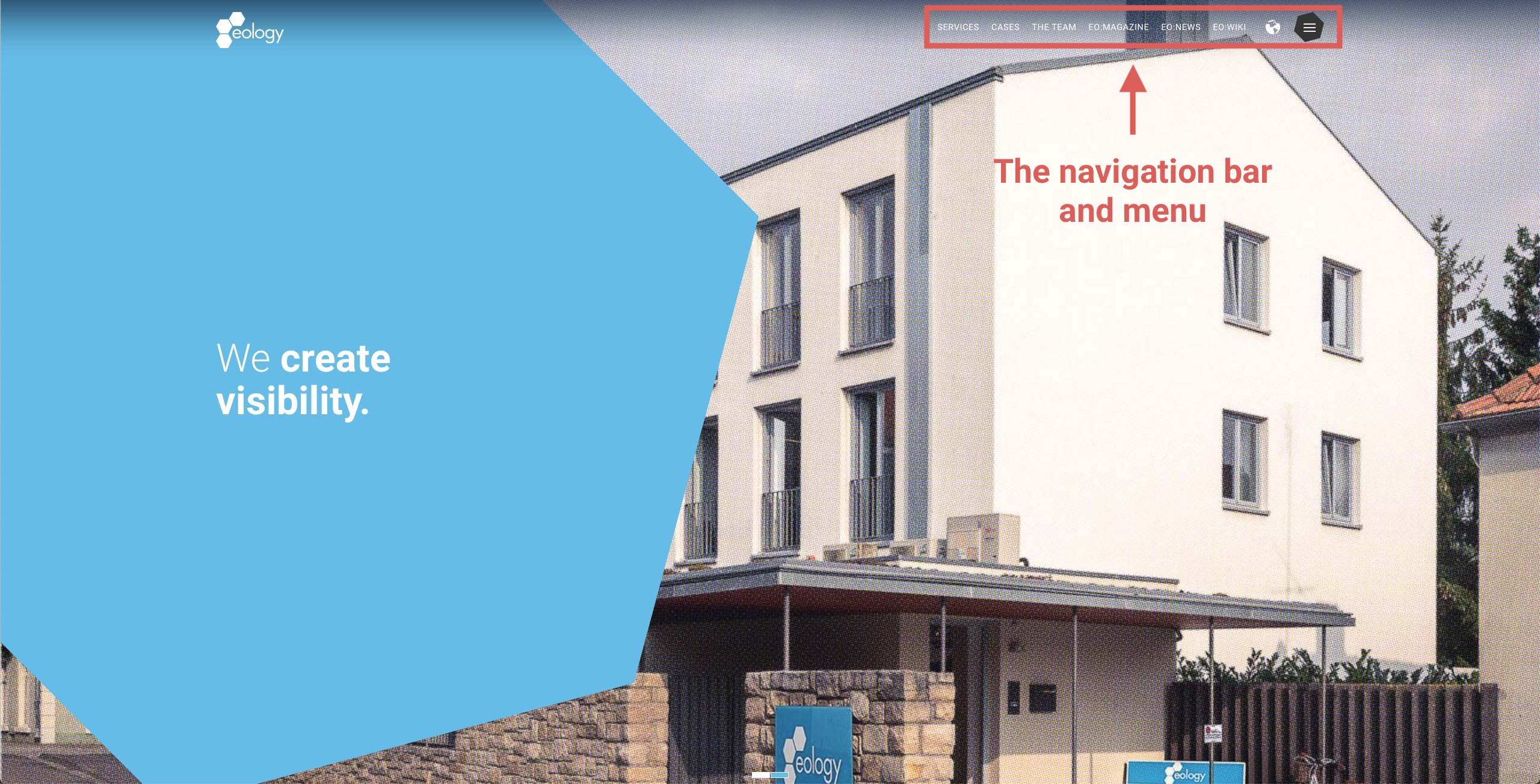
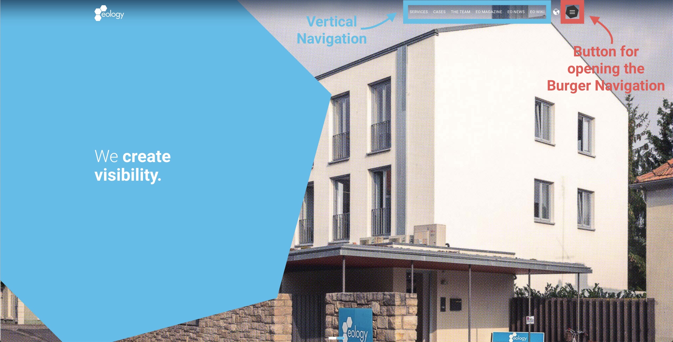
Example eology website: Here you will find the navigation in the form of a horizontal navigation in combination with a vertical (burger) menu.
Especially with regard to the different behaviors of your website visitors, navigation is important. While some people go directly to the page they want to go to – either by entering the appropriate URL or by using the search function on the page – there are others who like to click through first. It is precisely for this second type of website user that navigation becomes essential. They need it to find their own way. Without a main menu or main navigation, frustration would quickly set in as they simply wouldn’t find what they were looking for, and the user experience would be bad. Therefore, it is fundamental that a site is well and sensibly structured and intuitive to use.
What types of website navigation are there?
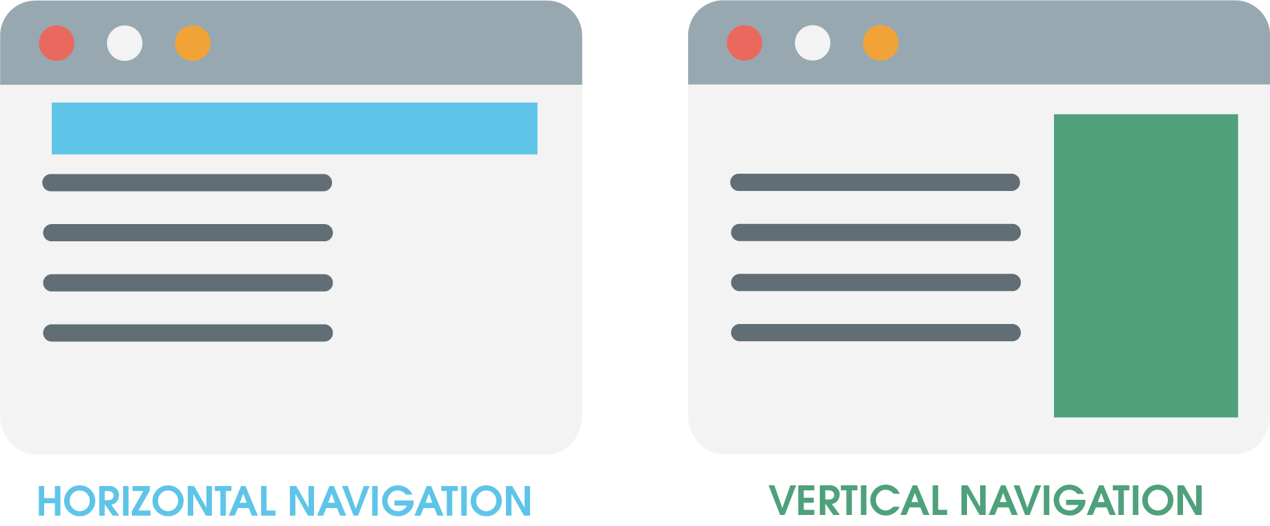
Roughly, website navigation or the individual menu types can be divided into horizontal and vertical. Some of the best known and most important navigation types are listed below.
Horizontal navigation types
Horizontal navigation is the type that has been around longer of the two. In other words, it’s a real classic. This version was considered the standard for years and was widely used as a best practice. It stands out because users have already been used to this type of navigation for many years and simply follow their habit. The drop-down is therefore logical and understandable. However, horizontal navigations are primarily designed for desktop use, as the aspect ratio is more suitable here. Meanwhile, you will therefore often find horizontal navigations in combination with drop-down menus. Drop-down menus are a combination of horizontal and vertical menus.
Mega Menu
The mega menu is the most used horizontal navigation bar. It has a multi-level structure. That means it first consists of the top category, which you can click on. After the click, all subcategories that belong to the corresponding category appear. These appear then either in a drop down (from top to bottom) or in a fly out (from left to right).
ATTENTION:
A mega menu has a lot of room for creativity, but should never become confusing. Otherwise, you will worsen its usability or user-friendliness.
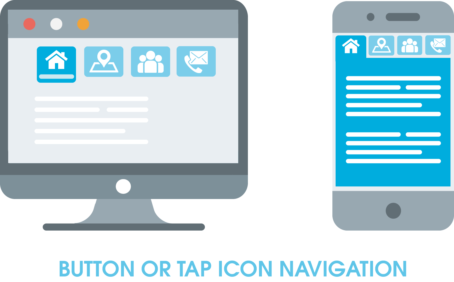
Button bzw. Tap Icon Menu
With the help of buttons or icons you can design this kind of horizontal navigation. The individual fields are the top or main categories, similar to the mega Menu. If you click the button, the category page opens.
Note: With this type of menu, it is important that the terms you display as buttons or icons are clearly assignable. They should be clear to the website visitor and not cause confusion. If in doubt, write below what content awaits him. Otherwise, he may not find what he expects and jumps off.
Vertical navigation types
Due to smartphones and the resulting change in aspect ratio, navigation should also be adapted. Horizontal navigation is thus not always the perfect solution for new screen formats. Therefore, vertical navigation types were created, which offer an alternative to the previous standard.
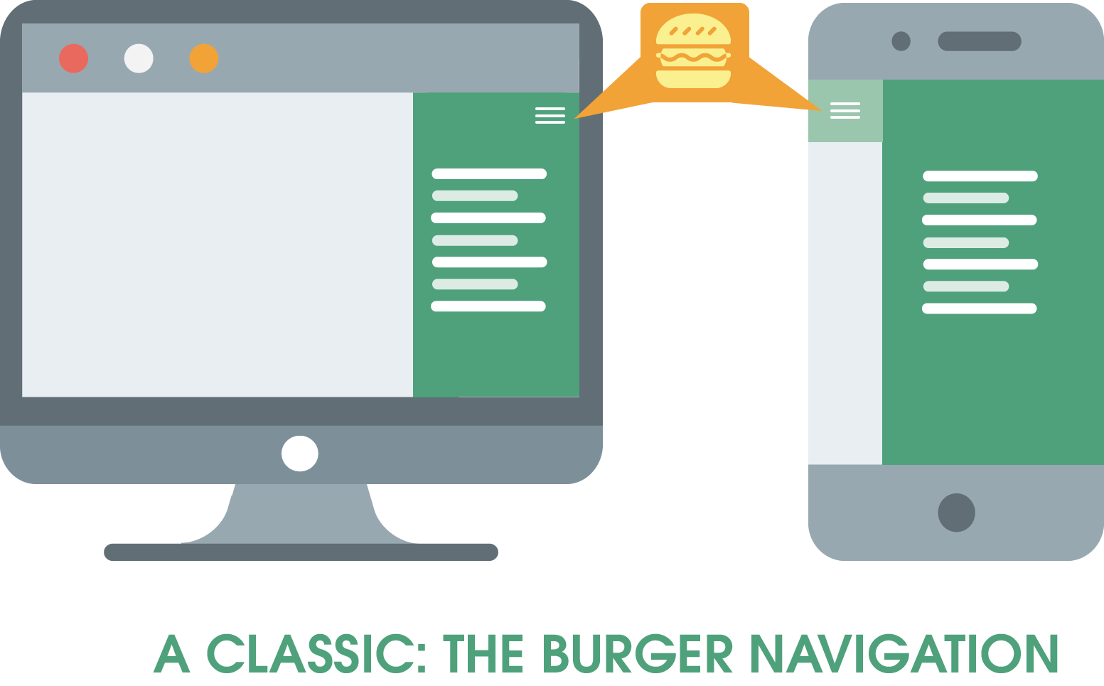
Classic Burger Menu
The burger or hamburger menu has become the navigation type you find on most websites. You can recognize it by the three bars stacked on top of each other, which remind you of the shape of a burger – hence the naming. If you click on this navigation element, the menu appears. This minimalistic menu style is especially popular on modern sites.
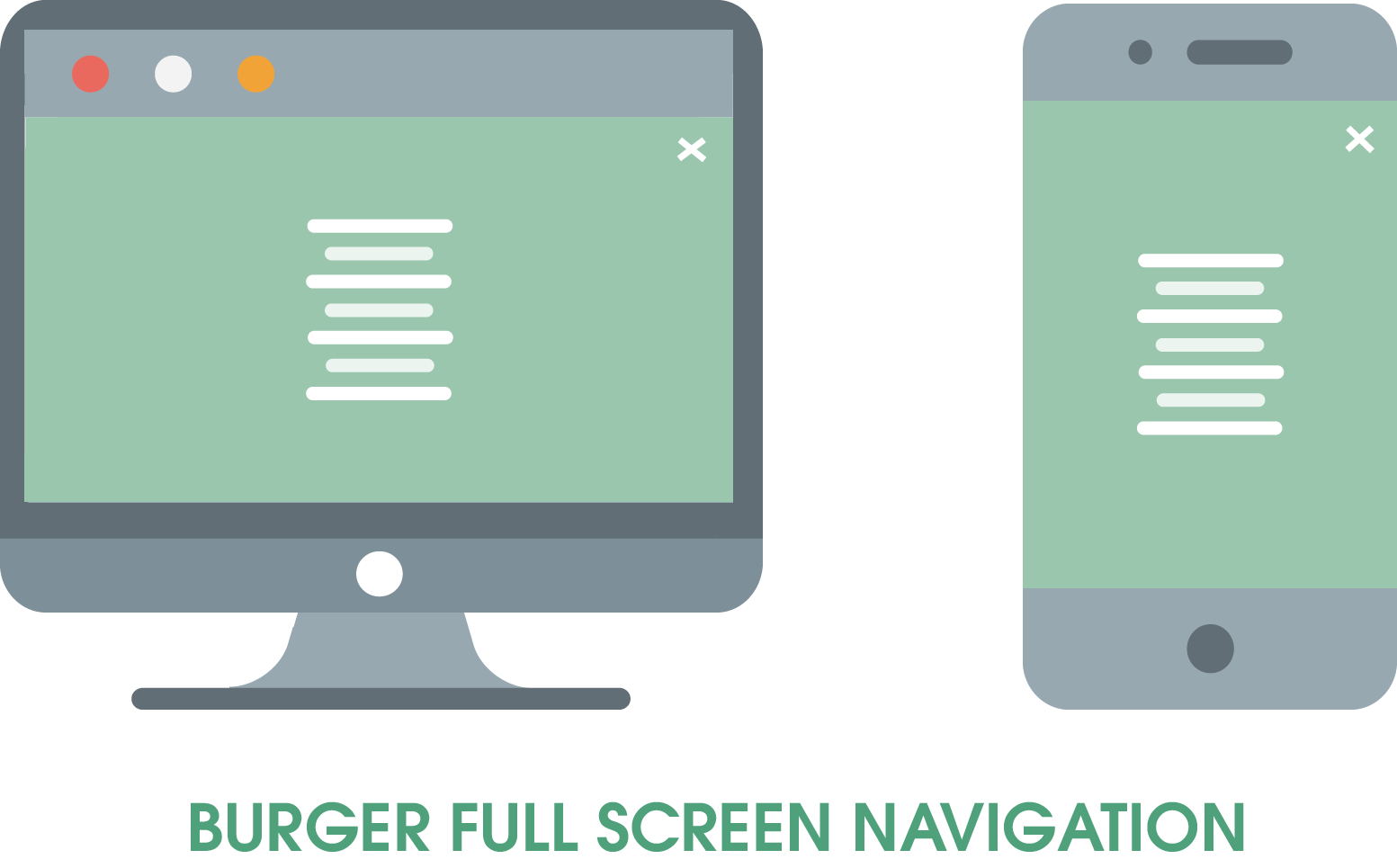
Burger Full Screen Menu
The burger full screen menu is the next level or the further development of the original hamburger menu. After clicking on the burger menu icon, the menu bar is displayed in full screen view. This helps you to give individual menu items even more expression and draws full attention to the navigation, since nothing else is visible apart from it.
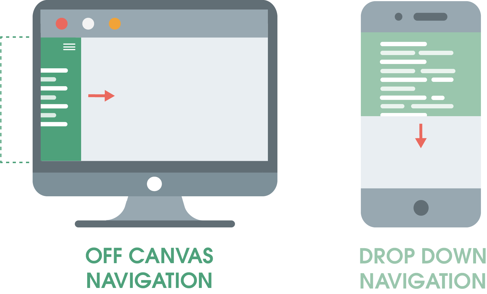
Off Canvas or Drop Down Menu
These two variants also exist as navigation types for desktop and mobile. They are menus that become visible by clicking on the corresponding arrow or button. In doing so, they appear from left to right (off canvas) or from top to bottom (drop down) from the invisible area of the website. It is thus a responsive navigation, reminiscent of sliders on a website.
Bonus: The great advantage of these two types is that they are innovative, intuitive and interactive. So, they are perfect for modern websites.
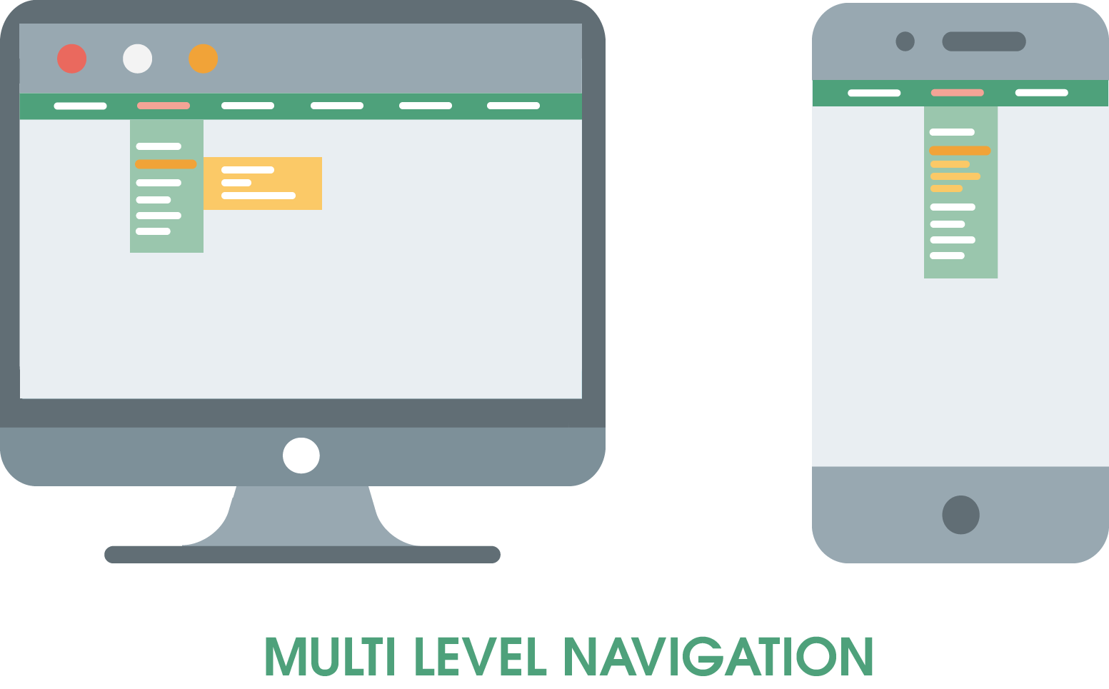
Multi Level Menu
Multi level navigation is a hybrid form. It is a vertical navigation bar that contains the top categories. A drop-down menu then takes you to the subcategories. If you click on one, it will be opened in another menu. In the mobile version, the products are simply folded out under the corresponding category. The navigation consists of different levels and provides, unlike the mega menu, more clarity, because only what you want to see is displayed.
Display of a multi level menu
An example of this are online stores for clothing. The top categories in the horizontal menu could be “Ladies”, “Men”, “Children”. If you click on “Ladies” the subcategory of the first drop down menu is then again “Clothes”, “Shoes”, “Accessories” and the following further drop down menu, if you click “Clothes”, could contain the categories “Skirts”, “Jeans”, “Sweaters”, etc.
In summary: Horizontal vs. vertical navigations
HORIZONTAL NAVIGATION
VERTICAL NAVIGATION
ADVANTAGES
– Established for years and therefore known by the user – All menu items are in the visible area and above-the-fold – Takes up only a small amount of screen space
– Unlimited number of menu items and sub-items – Sorting of menu links according to importance – Content of the website can start directly at the top of the screen
DISADVANTAGES
– Screens that are higher than wide (smartphones, tablets, …) have display problems – Rather inconspicuous – Number of menu items is limited by the width of the screen – Number of possible subcategories is limited
– If there are too many menu items, scrolling is required → Visible area is limited – Visual transition between content and navigation can lead to confusion
Table 1: Horizontal vs. vertical navigations
There are almost no limits to creativity when it comes to navigations. If you let your gaze wander attentively through the web, you will notice that it is rarely a case of either/or. Often modern websites use a combination of vertical and horizontal navigation and different types of menus, similar to our website.
This is how the navigation and menu are integrated on the eology website
What does website navigation do for SEO?
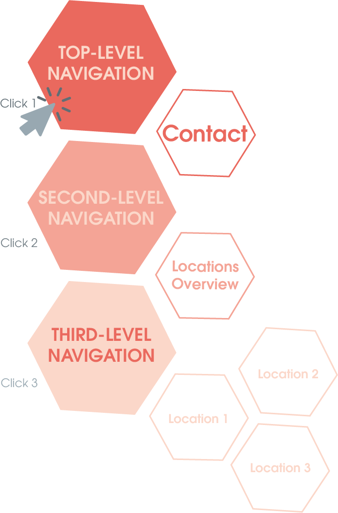
Internal linking is a strong ranking factor. For this reason, you should make sure that the navigation point is also named after the main keyword of the page, if possible. In addition, the internal linking structure sends signals to the Googlebot that tell it how important this page is. Landing pages that can be reached with fewer clicks are always more relevant than others. The goal is to make about 70-80% of all web pages reachable with only three clicks. The flat structure plays a significant role not only for search engine optimization, but also in terms of usability for the user.
What should you pay special attention to when creating navigations?
There are two recommendations that have been established for years when it comes to creating websites and their navigation: the three click rule and the seven plus/minus rule – besides the naming, both are rather recommendations than rules.
Three click rule
The three click rule has long been a standard among web experts. It is a recommendation that all content on a website should be accessible via three clicks. This increases usability, makes it easier for your users to visit your site and avoids confusion.
Die Drei Klick-Regel
Seven plus/minus rule
In 1956, the American psychologist George Armitage Miller studied the short-term memory of people. He came to the conclusion that the human brain can usually only grasp about seven units at a time. Depending on the person, this varies by plus/minus two units. These seven units are called “Miller’s number” for this reason.
The short-term memory and attention span of people is very important, especially in connection with digital media. This is why the seven plus/minus rule is still relevant today when it comes to building websites, their navigations and the content. The cognitive load should therefore be kept as low as possible, especially because additional distractions are much higher nowadays. The seven plus/minus rule helps you to build up your navigation in such a way that it does not overwhelm your users, so limit your navigation elements or sections to seven plus/minus points.
How do you adapt the navigation of the website to different devices?
Nowadays, it is important that your website is not only adapted to desktops, but can be displayed on all devices without any problems. Mobile versions of the site or a responsive design are therefore a clear must – especially in view of the increasingly influential mobile-first principle. A responsive navigation is therefore the buzzword you need in this context. This guarantees that all navigation elements are clearly visible and clickable on mobile devices, despite the lack of space. You should also keep in mind that smartphones, tablets and the like are usually equipped with touchscreens. Make sure that elements are placed in such a way that they are not clicked by mistake. This only offers unnecessary potential for frustration.
The website navigation and its structuring
In order to create a sensible structure, you should first take a close look at the structure of your website. Take a look at your sitemap. Which pages are on the top level and which are below? Identify them and structure your navigation accordingly.
This way you can show your visitors via the menu what your website has to offer. The overview of all pages helps to lead them to other pages and to offer them additional exciting content there. Additionally, you can sort this list by importance. This way, users can see what is the most relevant right at the beginning of their reading.
Conclusion: Why a good navigation (structure) is so important
It is important to have a well-structured and intuitive navigation, because you can give different impulses to your visitors. For example, you can offer your visitors orientation on the page and show them where they are. In addition, they can reach their goal more easily via a menu. For this purpose, the navigation should of course be structured in a target-orientedway, otherwise the visitor will quickly leave the page again. A good structure is therefore the basis of successful usability.
Excursus:
A breadcrumb and/or footer navigation can also be helpful. The former you deposit on the individual landing pages themselves. This way, the user sees the path he has already clicked through until he arrives at the page he is currently on. The footer, on the other hand, once again includes all the links that are important for the Internet user, such as imprint, contact, etc., and is thus another option for navigation. A footer navigation has long been standard on most websites. This way, users know that they simply have to scroll to the bottom of the page to find the most relevant links and pages.
Google is no longer the only relevant search engine; AI-based systems are changing the way we search for and find information. Read our detailed assessment now. ... Continue reading
Algorithm and crawler ensure that you get the right result for your search query. For this, a complex process runs in the background after the search. How exactly this works and what you always wanted to know about Google search, you can find out here! ... Continue reading
SEO texts are texts on the internet that have been specifically optimized so that search engines can find or understand them better. This works by answering search queries with keywords in the text, that sends Google the signal that the content is relevant to the respective search query. ... Continue reading


