
UTM Parameter
With UTM parameters you can track the success of your online marketing campaigns. Learn how to generate them correctly here! ... Continue reading

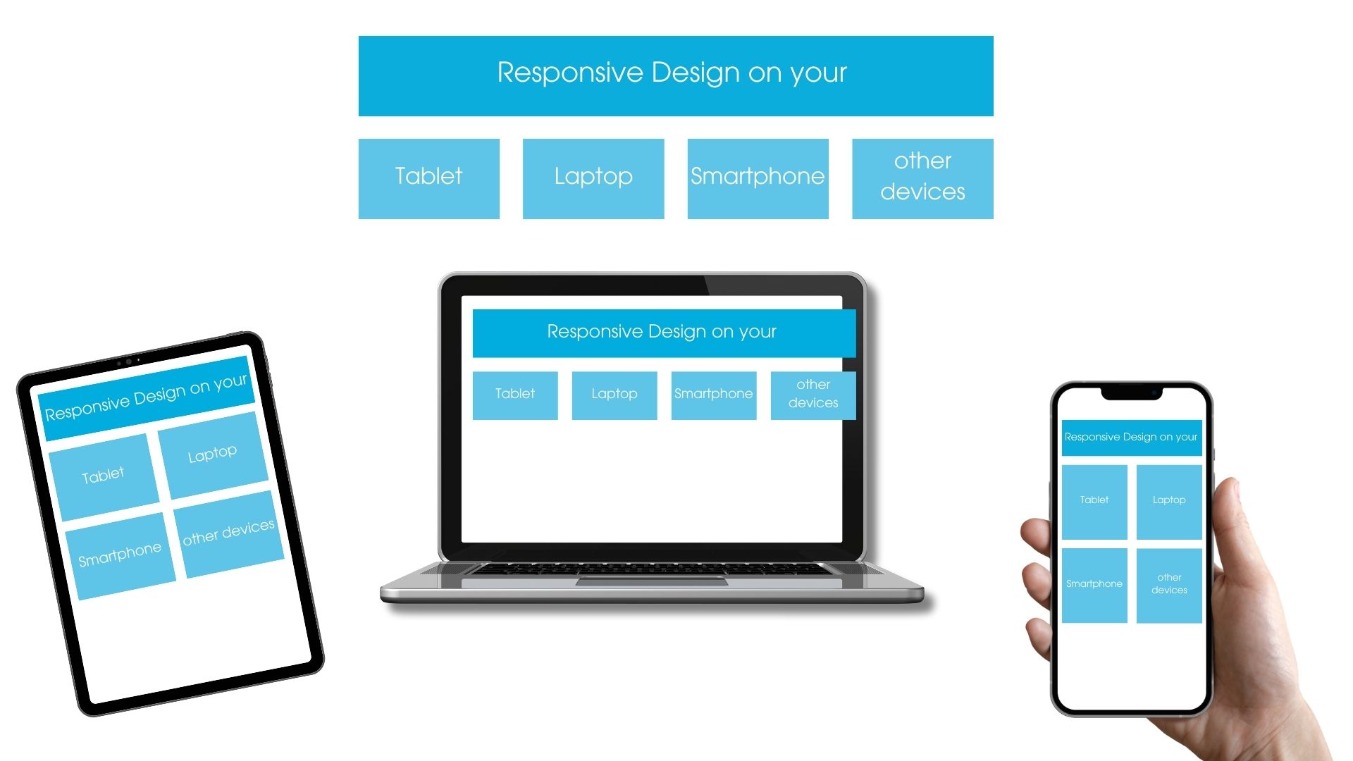
Responsive web design is the adaptation of the layout of a website to the output medium (computer desktop, tablet and smartphone screen). Using so-called media queries (e.g. HTML5 and CSS3 media queries), the output medium can be analyzed and an appropriate layout can be displayed. In this way, content and navigation elements of a website adapt to the screen resolution of the (mobile) end device. The mobile-optimized presentation of websites has resulted in a rethinking of the conception of websites. The focus is now less on presentation and more on efficient information transfer. As a result, the presentation of content can change depending on the end device:
Quite simply. The answer is yes. There are several reasons for this:
Websites that have become more and more complex in their structure over the years and whose substructure is outdated are not quite as suitable for the implementation of a responsive design, which is why you should think about a general modernization of your entire website before you go for the responsive design.
A fixed price range can often not be determined for projects involving responsive design. Mostly, the price depends on the desired scope of the project, and the customer’s budget also plays a decisive role.
As a rule, pages in responsive design are about 30 to 40% more expensive than a conventional page. However, you save the cost of web development of versions designed for mobile devices. The additional effort for the responsive page is usually limited to the development and implementation phase. The advantages become clear in the later stages, namely in content maintenance, in the implementation of updates, as well as upcoming changes to the website. Because in such matters, there is no need to maintain multiple versions for desktop and mobile views. On the one hand, this saves an enormous amount of time and therefore money, but on the other hand, it also creates a uniform appearance across all end devices.
With UTM parameters you can track the success of your online marketing campaigns. Learn how to generate them correctly here! ... Continue reading
Pay per click, or PPC for short, is a billing method in online marketing. It is used primarily in paid advertising, where it is used to charge for advertisements according to the number of clicks. For this reason, PPC is sometimes also referred to as click compensation. The advantage for you as an advertiser is that you only have to pay when an actual action is taken by the user, namely clicking on the ad. It is a common payment method when budgeting for campaigns on Google, Facebook, Amazon and Co. ... Continue reading
The nofollow tag is the signal to a web crawler not to follow a link. When you should set a nofollow link and how it affects SEO, you can find out here! ... Continue reading
You want to learn more about exciting topics?