

Google Lens in YouTube Shorts: Visual search enhances short video experience
Google is expanding the functionality of YouTube Shorts by integrating Google Lens, enabling visual search within Shorts. Find out more here. ... Continue reading
| 01 min |

| 25.01.2021 | 03 min |
Google is giving its mobile SERP (search engine result page) a new design. The internet giant wants to offer its users a modern experience when searching for information. With the “refreshing”, it primarily pursues three goals that are supposed to improve the user experience:
The new design should be available on all mobile devices in the course of the next few days.
Google wants to make it easier for its users to read content. To this end, the company is starting with the appearance of sections and labels. These will be larger and clearer than in the original design. This should enable users to find what they are looking for more quickly.
Google is also simplifying the design. In plain language, this means that the search company is optimizing individual sections and event card designs. The resulting empty space is intended to help users focus on the essentials and the important content.
Last but not least, the company is working on a more modern approach with the redesign. The new look is intended to be simple and at the same time friendly and accessible.

The main elements of the redesign at a glance
The refresh was spearheaded by Aileen Cheng, who is Google’s designer and the driving force behind the redesign process. On Google’s The Keyword blog, she explains the five main elements that are part of the new mobile redesign and the purpose behind it.
The top goal of the refresh was to simplify the Google layout. Aileen Cheng commented:
„We want to let the search results shine, allowing people to focus on the information instead of the design elements around it. It’s about simplifying the experience and getting people to the information they’re looking for as clearly and quickly as possible.“
This change and simplification of the look is therefore intended to bring information more into focus. This should help users find what they are looking for more quickly.
Mobile devices require certain extras to guarantee readability and meet everyone’s expectations. For this reason, Google decided to take action here as well in the course of the redesign. The result: fonts are getting bigger and thicker. This is particularly noticeable in the titles of search results. In addition, Google is now increasingly using its own font. This font is already used in Gmail and Android but is now also to be found in the mobile search. Aileen Cheng comments:
„Bringing consistency to when and how we use fonts in Search was important, too, which also helps people to parse information more efficiently.“
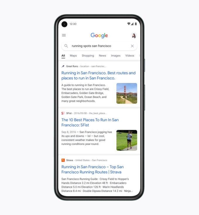
Google also wants to create “Breathing Room” for its users. The idea behind this is to do away with shadows and thus direct the focus to what the user is looking for. For this, Google relies on an edge-to-edge design.
Google also experimented with different colors to better highlight important things. In order not to distract users too much, the look should still be relatively clean. Google designer Aileen Cheng made the following statement:
„Some other iterations of the redesign experimented with using lots of bold colors, and others tried more muted tones. They weren’t quite right, though, and ultimately the team focused on centering content and images against a clean background and using color more intentionally to guide the eye to important information without being overwhelming or distracting.“
Last but not least: The Googley feeling should of course not be lost despite the refresh. For this reason, you will find many rounded shapes in the new design. The round shapes are already known to the users through the Google logo and thus create recognition value.
Recurring circles, which you can find not only in the logo, but also in the search bar and in the font used by Google, should make the look more accessible, friendly and human.
Additionally, as an agency, we’ve noticed that Google is currently (as it has from time to time in the past) experimenting with the fonts in the desktop version as well. Similar to Android, Gmail and now the mobile SERPs, the new preferred font is the in-house font “Google Sans”. This may soon replace the previously used font “Arial”.
This is important because it could have a strong impact on snippets. Especially title lengths would probably have to be optimized as soon as Google finalizes the font change.
Olga Fedukov completed her studies in Media Management at the University of Applied Sciences Würzburg. In eology's marketing team, she is responsible for the comprehensive promotion of the agency across various channels. Furthermore, she takes charge of planning and coordinating the content section on the website as well as eology's webinars.
Google is expanding the functionality of YouTube Shorts by integrating Google Lens, enabling visual search within Shorts. Find out more here. ... Continue reading
| 01 min |
Google is intensifying the integration of advertising into its AI-powered search functions. This means you can now also place your ads in AI Overviews and AI Mode. Find out more here. ... Continue reading
| 01 min |
YouTube is turning 20 and looking back on an impressive journey: from its first unassuming zoo video to the world's largest video platform. But what makes YouTube what it is today, and what innovations will shape its future? A look back at 20 years of the moving image revolution, the creator economy, and new trends. ... Continue reading
| 02 min |
Du möchtest die brandheißen News der Branche nicht verpassen?

